
Payment App Homepage Redesign
Restructured IA and core payment flows, enhancing discoverability of offers and rewards. rNPS +3.8 points post-launch.
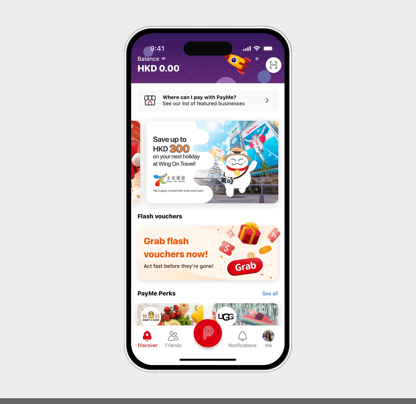
PayMe is HSBC's mobile payments app in Hong Kong, loved by over 3 million people since 2017. What started as a peer-to-peer (P2P) payments app has grown into a full mobile wallet spanning person-to-merchant (P2M) payments and a B2B platform, where users pay at thousands of stores and restaurants, and discover exclusive offers and rewards.
But the app homepage wasn't surfacing what matters – analytics and stakeholder interviews showed users were overlooking high-value features like rewards, offers, and merchant payments, hurting engagement and retention.
Problem
How might we redesign PayMe's homepage to improve feature discoverability while balancing business goals with ease of navigation?
Outcome
I led the homepage redesign, building a scalable IA that improved feature discoverability. Post-launch, rNPS rose 3.8 points.
Role
Lead UX & Product Designer
Timeline
7 months (Dec 2022 - Jul 2023)


Final designs & solutions
Over 6 months, I redesigned PayMe's homepage by restructuring the IA, introducing Quick Actions, and reworking the voucher experience.
After launching, we saw a 3.8-point rNPS lift in 2H23. The redesign shortened time-to-task for key features and gave the team a foundation they could ship on top of.

New IA with grid system
I replaced the unstructured homepage with a grid-based design system, adding consistent padding between sections. The page finally had a reading order the team could build on.

Quick actions
I created a new section on top of the homepage, grouped most used utilities into a new “Quick Actions” section to shorten time-to-task for the most common user intents.

Instant voucher grab
I redesigned the voucher component with an inline call-to-action button. Users could claim and pay the moment they spotted a deal, without leaving the feed.

Straight to payment
I removed the P button and its slide-up action sheet, placing "Pay businesses" directly in the bottom navigation. 2x faster access for an action millions of users repeat daily at checkout.
We looked into clickstream data from April to June 2022 and consolidated the insights.
67%
of active users tapped the P button after opening the app
making it the most used nav item, generating 32M clicks. Users were gravitating toward actions, not browsing.
91%
of action sheet clicks went to "Pay a friend"
16.5M out of 18M total. "Pay a business" captured just 9% despite being a high-frequency action. The extra step was killing discoverability.
27%
of users who saw the hero banner clicked it
307K unique clicks from 1.13M impressions. Users were spending 15 seconds looking but not acting.
Existing pain points

1 - Homepage that hid best features
The homepage lacked a clear hierarchy, forcing users to scan competing visual elements with no obvious entry points. This slowed navigation and made the experience technically unscalable.


Wireframes
Building on these insights, I reorganized the homepage into distinct content clusters. I focused on defining reusable components that could flex as the product evolved, so the next feature wouldn't require another redesign.

I conducted three rounds of mixed-method testing, A/B comparisons and scenario-based role-play, to test the redesign before committing.

I tested a tap-to-expand arrow versus a swipe gesture but neither won. Users wanted every action visible at once, with no hidden states.

Four out of six preferred option D with the familiar "P," but only two noticed the flow change. I decided to go with the QR code icon, clarity over familiarity.

Before
Unstructured layout with no consistent spacing, sections competed for attention with no clear reading order.
After
To address this, I implemented a grid-based design system with consistent padding between sections, giving the page a clear hierarchy and scalability to build on top.


Before
The P button opened a slide-up action sheet, requiring an extra tap to access payments and other key features.
After
To address this, I introduced a Quick Actions section at the top and a direct "Pay businesses" button in the bottom navigation, giving users one-tap access to the most-used features and pay the merchants.


Before
Two taps required to claim a time-limited voucher, with offers scattered across the homepage and no dedicated section.
After
To address this, I designed new voucher components with a "Grab now" button and a dedicated offers section, giving users instant access to deals.

Visual designs
I explored 15 homepage variations before narrowing to 3 stakeholder-ready concepts. Each was evaluated against clarity, scalability, visual hierarchy, and adaptability.
Header banner guidelines: safe area specs for marketing handoff


The homepage now works for seasonal campaigns and brand partnerships.
(Screenshots from 2023–2026)


Launch Strategy
We shipped in two phases. I worked with the team to decide what to launch first, prioritizing changes that could be validated independently before committing to the full navigation overhaul.


App store updates
To support the rollout, I also created App Store and Play Store assets that showcased the new design and features.
These were designed to boost new features awareness and give prospective users a reason to download PayMe app.
I reworked the hero banner behavior to reduce motion sensitivity and give users more control. The update was validated against WCAG standards and shipped as part of our ongoing accessibility work.

Original design: auto-scrolled offer banners, giving users a quick preview as they passed through the homepage.

Updated design: removed auto-scroll, added a "See all" button and offers landing page, giving users control over their browsing pace.
Lessons learned
We defined three success criteria before starting – and hit all three. The phased rollout shipped as scoped, rNPS improved +3.8 points post-launch with users citing easier navigation as the top feedback. I'm proud of the structure we shipped, and even prouder that it held up as new features were added after launch.
This project taught me that homepage design is really prioritization design. Like many other products, every team wants their feature to be up front on the main page. Every metric has a stakeholder behind it.
The hard part isn't designing the layout, it's building a framework for deciding what earns space and what doesn't, that considers the present and future product goals and blueprint, balancing users' needs when changing design and payment flows, and then defending those decisions with research.

