
Web3 Gateway to Capital Markets
Designed a tokenized RWA trading platform – web dashboard, mobile app, and design system.
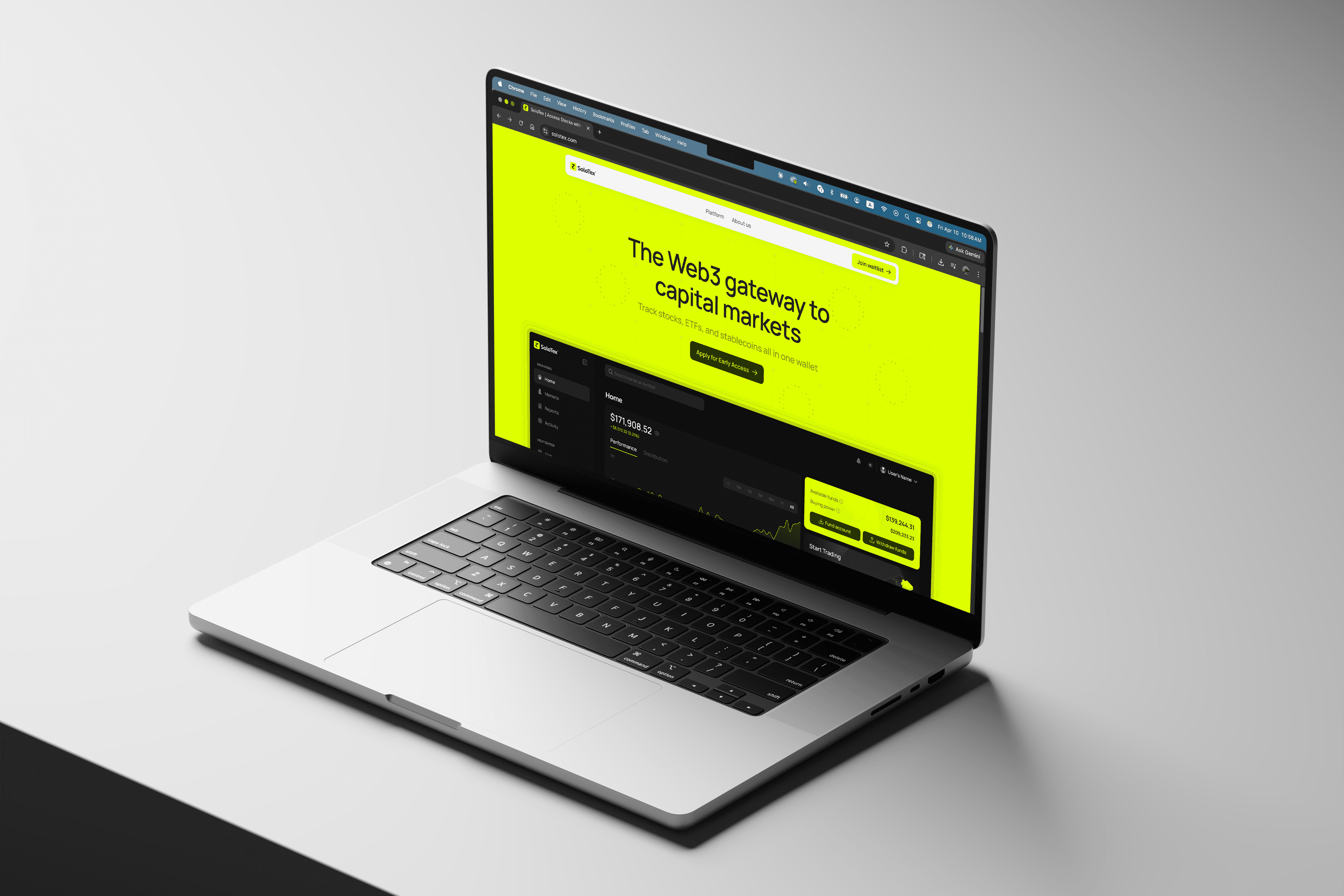
SoloTex is a tokenized real world asset (RWA) trading platform, a dashboard-first web and mobile appp where users hold and trade tokenized stocks, ETFs, and stablecoins together. It bridges two worlds: the compliance-grade trust of traditional finance, and the permissionless energy of Web3.
Most RWA platforms in this space built strong tokenization infrastructure but offered little consumer-facing UX. SoloTex is building the consumer product that makes tokenized assets feel as natural as checking your stocks.
I joined a two-person design team to own the responsive web app design, mobile app, and co-manage the design system alongside the lead designer. My task was to make sure the design matched the ambition.
Problem
How might we make tokenized investing feel as familiar as checking your stock portfolio?
Status
Pre-launch. 5,000+ users on the waitlist.
Role
UX & Product Designer
Timeline
4 months (Jul - Oct 2025)
Live site

Impact & value
The problem
The hardest thing about designing an RWA platform isn't the complexity. It's the credibility gap.
We are targeting two types of users. The crypto-native user is comfortable with wallets and volatility, but skeptical of Wall Street. The traditional investor understands stocks and ETFs, but thinks crypto is a casino. Neither starts with trust.
Both come with different mental models of what "investing" means. The product has to earn both, without compromising for either.
This isn't just positioning. It's a design problem. Every screen has to answer one question: Does a crypto trader and a stock investor both feel like this product is made for them?
Proccess

Step 1: Auditing what existed (Week 1)
The lead designer had completed the core web app. I audited the visual language, component library, and logic to extend.

Step 2: Responsive dashboard design (Week 1-2)
I adapted the web app design across breakpoints while preserving the data-dense feel financial dashboards require.

Step 3: Mobile app design (Week 2-6)
The lead designer and I designed mobile app together. Mobile lacked the browser back button, so I audited modal headers and multi-page flows for setting edits.

Step 4: Onboarding design challenge (Week 4-6)
New users landed on an empty portfolio after registration. I studied how financial platforms handle empty states and redesigned a stepper native to the homepage that guides users through KYC, connect wallet, and fund account.

Step 5: Design system co-management (Week 6-9)
I co-managed the Figma design system and tokens with the lead designer. It had to work across light and dark themes without losing the premium feel.
Step 6: Responsive website (Week 9-12)
I designed and shipped the responsive website using Figma Sites and Figma Make AI in 4 weeks. Learn more on my takeaways on this post.
Reflection
Most design problems are about making something easier. RWA platform design is about making something believable. Users aren't just learning a new product, they're deciding if a new financial category is worth their trust. Every screen I designed was an argument for yes.
In a startup this fast, you make your best call and ship. I made the right calls for the context, but I'd push for usability testing on the mobile information hierarchy before launch. In financial products, instinct isn't data.
I'm happy with what we built, and I'm genuinely curious to see what the data says when it launches.

