

eCommerce Redesign & Checkout Simplification
Reduced checkout steps by 50% and surfaced upsell details
Fortress's eCommerce platform processed millions in electronics transactions annually, but its checkout experience was a conversion bottleneck.
Google Analytics showed checkout page load time at 6.52 seconds, significantly higher than other eCommerce sites under AS Watson Group. Research with stakeholders and users also surfaced multiple pain points across the product detail page (PDP) and checkout flow.
Over nine months, I contributed to the full-site redesign across web and mobile as part of an agency team, focusing on the product detail page and checkout flow – the critical conversion surfaces.
Problem
How might we redesign Fortress's eCommerce experience to match how customers actually shop, and reduce friction at the moment they're ready to pay?
Outcome
I redesigned the product detail page and checkout flow, reducing steps by 50% (from 6+ to 3) while surfacing services, link-sell accessories, and redemption gifts on both pages.
Role
UI/UX Designer & UX Researcher
Timeline
9 months (Oct 2021 – Jun 2022)
Live site
Impact & what changed

Streamlined checkout flow
We reduced checkout from 6+ steps to 3, removing redundant screens and modal pop-ups so users could complete their purchase faster with fewer decision points


Clear information hierarchy on detail page
We consolidated scattered promotion and variant link-sell options into scannable sections, so users can browse product details and purchase without information overload.

Add-on services visible at consideration
We surfaced service (installation, removal, extended warranty) on the product detail page, users can select these options at the moment of purchase consideration.

Coherent web and mobile design
We built consistent patterns and components across both platforms, users could switch contexts without relearning navigation or interaction patterns.
Stakeholder interviews
As part of the agency team, I participated in 4 interviews with the Fortress teams alongside the in-house senior designers to understand what was actually broken.
Business Unit identified the friction points on the product detail page
The checkout flow was fragmented with too many steps. Redemption gifts overwhelmed users by listing all available SKUs, and key information like delivery and link-sell accessories were buried or unclear.
Technical Team confirmed the systemic issues
Checkout required 6+ disconnected steps with modal dialogs and subpages interrupting the flow. Google Analytics showed the checkout page load time was significantly higher than other AS Watson Group eCommerce sites.
Customer Service noted the support burden
Users struggled with order tracking and delivery visibility, suggesting the checkout and post-purchase experience wasn't clear enough.


Me (in the yellow cardigan) during an interview with the Business Team on Oct 26, 2021.
Research workshop
On December 7, the full team ran a 5-hour UX workshop using journey maps, personas, and "How Might We" exercises to synthesize the feedback into actionable design directions. I participated in synthesizing the insights alongside the design team.
Core insight: The typical Fortress customer arrives with a product in mind or browsing by category, expects a smooth path to purchase, but hits information chaos on the product detail page, then complexity in checkout.


From this insight, the team identified four critical design directions:
HMW simplify cart edit experience
HMW make product detail page contents simple and attractive in a smooth way
HMW reduce unnecessary steps to check out
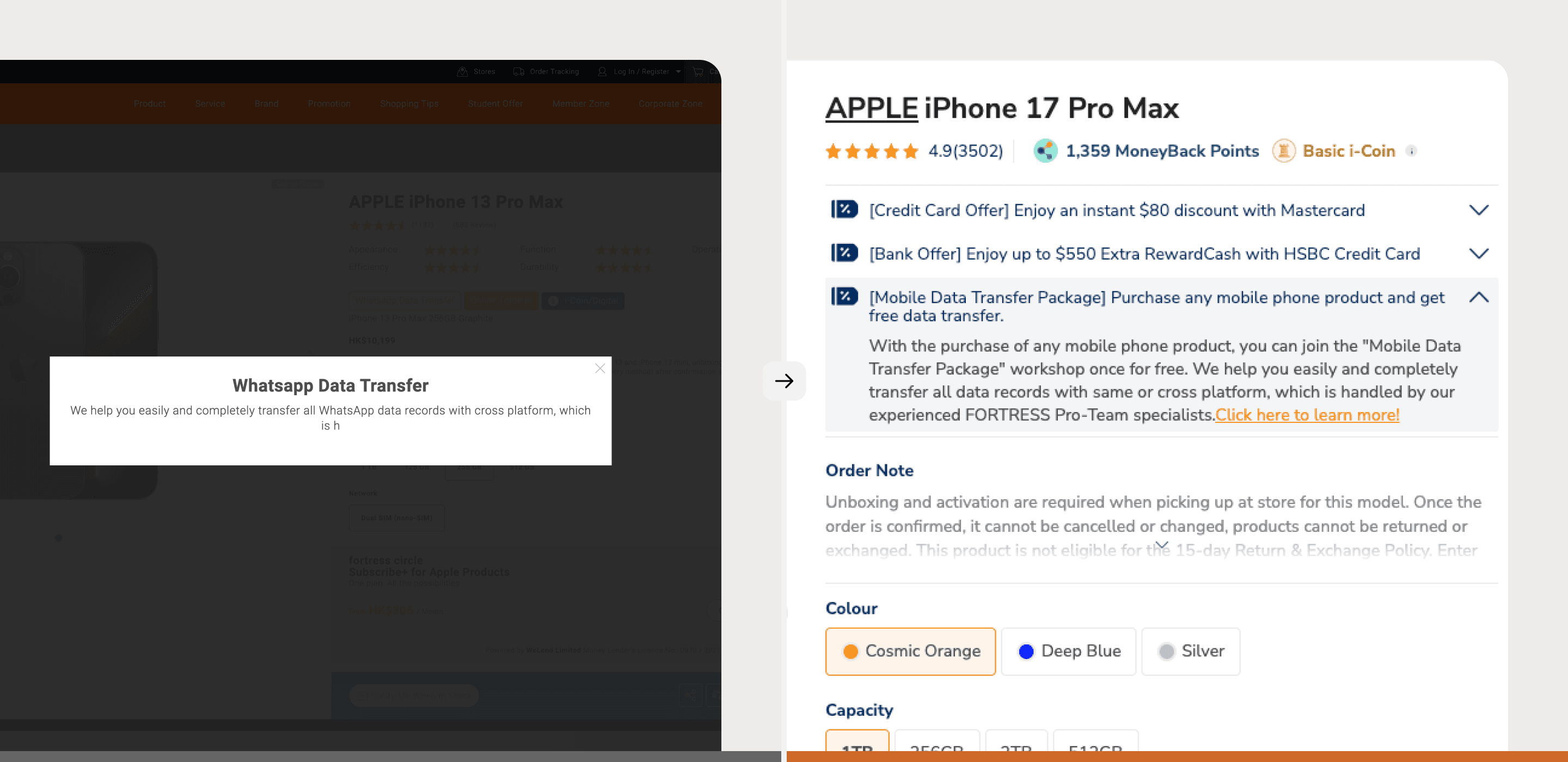
Product detail page redesign


Before
The 2-column layout prioritized the product image and unnecessary information (ratings and partnership) upfront, while burying critical details like price, variant selector below.
After
We restructured into a 3-column grid: essential info (image, variant selector, price, specs) stayed above, secondary info (promotions, services) in rows below, creating visual hierarchy and scalability.


Before
Modal pop-ups interrupted the browsing flow when users viewed options. Adding items to cart required multiple clicks through dialogs.
After
We replaced modals with tooltips and expandable tabs. Users can now browse and select promotions, redemption gifts, and service options directly on the page, reducing unnecessary friction and steps.


Before
Add-ons (installation, removal services) were scattered across sub-pages or missing entirely. Link-sell accessories and redemption offers were hidden, making them difficult to discover alongside core product information.
After
We consolidated all service offerings (installation, removal, warranty) directly into the product listing alongside link-sell items and redemption offers in scannable sections.

Streamlined checkout flow


Before
6+ disconnected checkout steps with modal pop-ups interrupting the flow. Add-on installation and removal services, warranty, promotions, and redemption offers were scattered across the experience, forcing users to make decisions in multiple places.


After
Checkout reduced to 3 steps: Shipping & Delivery, Payment & Redemptions, Order Review. Installation and removal services moved to the product detail page where users select alongside product specs, then confirm in checkout directly.
Takeaways
This was my first eCommerce checkout redesign. I came in assuming the problem was visual polish or slow servers. It wasn't. The problem was information architecture fragmentation at the moment of purchase.
Working on a 9-month deadline with multiple stakeholders taught me to scope ruthlessly. Without the clear directions from the UX workshop, we would have lost focus trying to redesign everything at once.
What I'm most proud of is building the design system to be extensible across platforms from day one. We didn't just solve the immediate problem, we built patterns and components that could scale as the team added features. Good information architecture decisions compound quietly.

