Reading time:
Building solotex.com with Figma Sites and Figma Make: what the tools could do, and what they couldn't
I designed and shipped solotex.com, our tokenized RWA trading product site, in 4 weeks. One designer, minimal dev support, built with Figma Sites and Figma Make AI. A 12-week traditional timeline, compressed to 4.

Overview
Two designers, five engineers, a CTO, and a trading platform release timeline that couldn't slow down. We needed a product site live in a month, and pulling an engineer was the worst option on the table.
So I build end-to-end with Figma Sites and AI tools, and only call in a dev for the one piece that needed it. Four weeks later, solotex.com was live. Months later I applied the same pipeline to tx.org, our parent company site – slower on the content side, but the place where some of the most interesting friction surfaced.
Here's where the tools earned their place, and where they didn't.
What I owned
Our lead designer had handed off 14 desktop screens, I owned the build from there – every responsive layout, breakpoint, and the published version.
Designing for Figma Sites output means committing to it from day one. Auto layout everywhere. Widths set to Fill, heights to Hug. Breakpoints in parallel, not as an afterthought. By the time the build was done, those 14 desktop screens had become 30 responsive screens across desktop, tablet, and mobile.

Original design file with 14 screens

Final design with 30 responsive screens on Figma Sites
What worked
One workspace, no handoff friction. I designed, applied responsive layouts, built with auto layout and grid systems, and shipped all inside Figma. That cohesion isn't new to web devs, but it's new inside a design tool, and it eliminated the usual three-tool stack (design → no-code platform → frontend build).
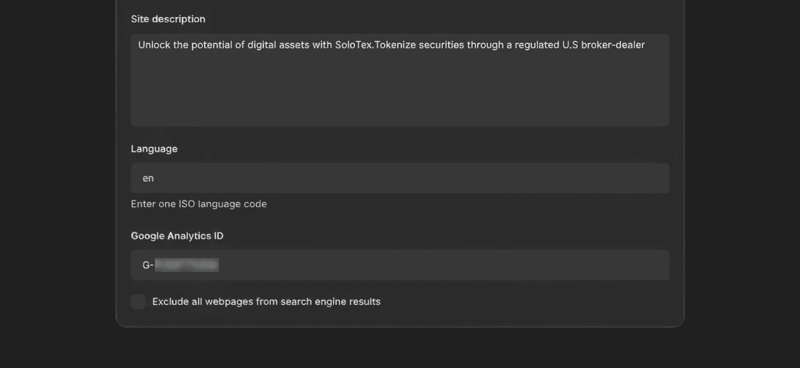
SEO and tracking shipped on day one. Google Analytics ID, meta keywords, and basic SEO settings live directly in the Figma Sites panel. For a marketing team that lives on attribution data, that saved a back-and-forth that would have eaten days in a traditional build.
Where AI tools hit their ceiling: the form
The contact form was the first piece I tried to ship with AI tooling alone.
The UI was ready. The interaction logic and backend weren't. Figma Sites has no native way to wire submissions, so I went to AI.
First attempt: Weavely, embedded via Figma Make AI. Code layer wasn't resizable in the frame. Injected a scrollbar on a static banner. Free-tier branding bled onto the page.
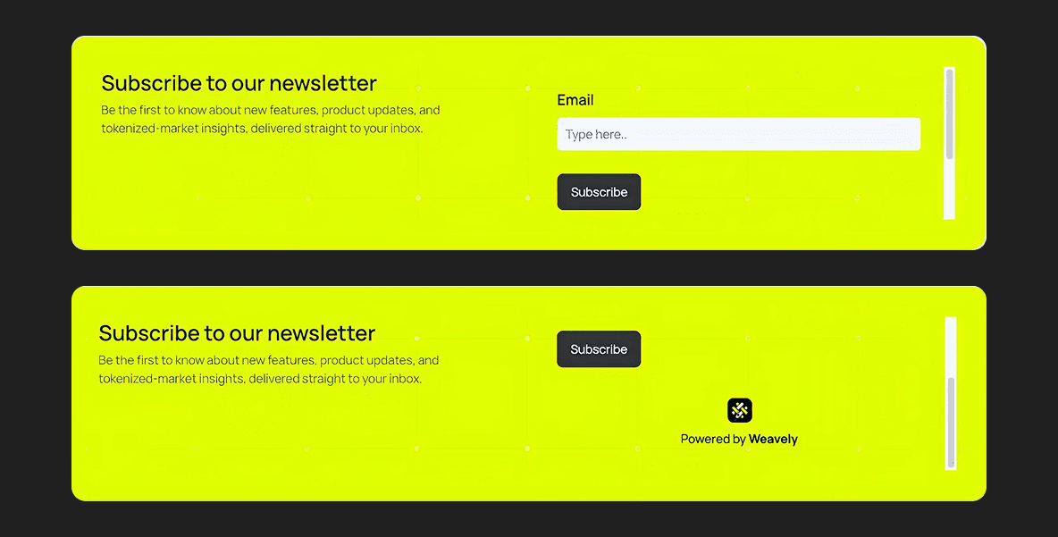
The scrollbar on the banner
Second attempt: Figma Make AI generating the form directly. It hit a wall at Firebase and reCAPTCHA. The output was thousands of lines of Tailwind, no component structure, no design tokens, hard-coded values everywhere. Fine for visual stubs. Not for anything touching a backend.
So I made the call, I updated the form as a dedicated page design in Figma, then exported the code via Figma Make AI. Our CTO merged the code with Firebase and added reCAPTCHA. A twenty-minute conversation that saved us a week.
Figma Sites and Make features earned their place on visual surfaces. Anything touching a backend, auth flow, or security primitive went to a dev.

Screenshot showing how Figma Make AI generates code from our design
Where Figma Sites fell short
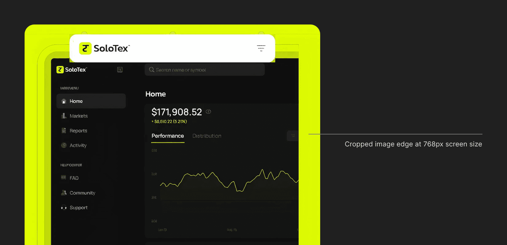
Animations
When Figma Sites interactions worked, they were the fastest way to add motion I'd used. Effects and transitions apply directly to components, no separate animation layer to maintain.

But weeks after the tx official site launch, animations that worked perfectly on solotex broke on tx. Same setup, same interaction flow, different behavior. We never figured out why, and ended up sacrificing our best transitions to keep tx stable.
Card interaction on solotex.com
Bug on tx site
Fixed interaction
Next time: start with simple transitions, layer complexity only after the core site is stable.
Graphics
Complex vector illustrations looked clean in Figma Sites design frame but broke on publish. Exporting them as flats fixed the rendering but cropped awkwardly across breakpoints.

I manually exported separate assets per device, spending extra time than I expected. The result looked significantly better than letting the responsive engine guess. Plan rasterized exports upfront across desktop, tablet, and mobile, and you save the retroactive fix.
Preview speed
Preview mode was great early on. As the site got heavier with pages and layered graphics, preview times crept up. By the end, I was waiting 30+ seconds to check a copy change.
Took ~20s to load the preview of "Join Waitlist" page
Why this matters for a small product team
If you're a designer at a startup where pulling an engineer means slowing the product, this is the pipeline worth knowing. Figma Sites and Figma Make AI-assisted code can credibly carry a marketing site or product landing page from first pixel to live URL—without a dev sprint, no-code subscription, or a three-tool handoff.
The real skill isn't the tooling. It's knowing when these tools belong in production, when to walk away from them, and when to hand a small, well-scoped piece to a dev.
I shipped solotex.com in four weeks, tx.org followed on the same pipeline. No engineering capacity burned on either. That's the trade I came in to make, and the one I'd make again.