One Month. One Website.
Minimal Dev Support.
One Month. One Website.
Minimal Dev Support.
A designer's field notes on shipping solotex.com straight from Figma –
bugs, workarounds, and all.
A designer's field notes on shipping solotex.com straight from Figma –
bugs, workarounds, and all.
6 min read
6 min read

TL;DR
TL;DR
Can a designer replace an entire front-end sprint with a publish button? We tested that hypothesis with a real deadline and real stakes.
Some parts of Figma Sites felt like magic. Others made me want to throw my laptop. Read on for the unfiltered version.
Can a designer replace an entire front-end sprint with a publish button? We tested that hypothesis with a real deadline and real stakes.
Some parts of Figma Sites felt like magic. Others made me want to throw my laptop. Read on for the unfiltered version.
The beginning
The beginning
Here's our situation: a startup with two designers (me included), five engineers, and a CTO – all heads-down building our trading platform and marketplace products. The typical website project at a company our size takes about three months: design, developer handoff, build, QA, revisions, launch. But we didn't have three months, and every engineer was deep in marketplace features. Pulling someone out for a full website build would've been irresponsible.
So the question became: can a designer ship a production website with only minimal engineering support?
I opened Figma Sites and found out. I ended up delivering two websites – solotex.com and tx.org. This blog focuses on SoloTex, which went from blank canvas to live URL in about a month. (tx took longer on the design side, different story for another day.)
Here's what that month actually looked like.
Setting up the file
Setting up the file
Our lead designer had already crafted the desktop design months earlier. I took it from there – building out the responsive layouts with the Figma Sites output in mind from day one.
Our lead designer had already crafted the desktop design months earlier. I took it from there – building out the responsive layouts with the Figma Sites output in mind from day one.

Original design file

Final design with 30 responsive screens on Figma Sites
That changes how you work. Auto layout on everything – make sure you set your wrapped design width to "Fill" and design frame heights to "Fit content". Obsessive frame hierarchy. Breakpoints designed in parallel, not as an afterthought.
That changes how you work. Auto layout on everything – make sure you set your wrapped design width to "Fill" and design frame heights to "Fit content". Obsessive frame hierarchy. Breakpoints designed in parallel, not as an afterthought.
Staging without the staging headaches
Staging without the staging headaches
If you've never dealt with a traditional staging setup, here's what it usually looks like: the dev team deploys a test version of the site to a private server, and to view it you need to be on the company VPN or Wi-Fi.
The .figma.site base domain flipped that entirely. Every time I wanted to check how something felt in a browser, I hit publish and previewed the live URL.
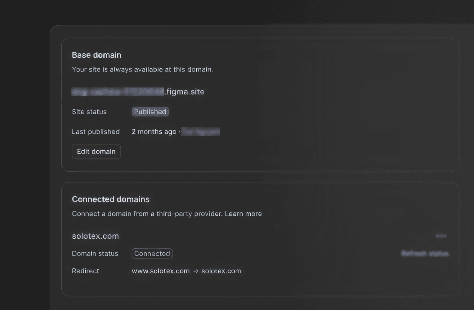
Our team used the link for internal reviews. The marketing manager, the QA, the CTO, everyone could see a real, functioning website from anywhere, on any device.
We have our own domain for the final site, but honestly, the .figma.site staging workflow was one of the most freeing parts of the whole process. The feedback loop shrank from days to minutes.
Where the AI tools let me down
Where the AI tools let me down
Let me be honest about the rough edges, because this wasn't all smooth sailing.
Let me be honest about the rough edges, because this wasn't all smooth sailing.
The form that fought back
The form that fought back
We wanted to eliminate the developer handoff entirely, so we tested AI-powered tools like Weavely to generate a working email form that I could embed directly into the Figma Sites page via Code Layers.
The idea was great. The execution? Not so much.
After merging the generated code into a design frame on Figma Sites, things broke. The logo showed up randomly inside the contact banner. A scrollbar appeared where it shouldn't have. The code and the design just didn't play nicely together.
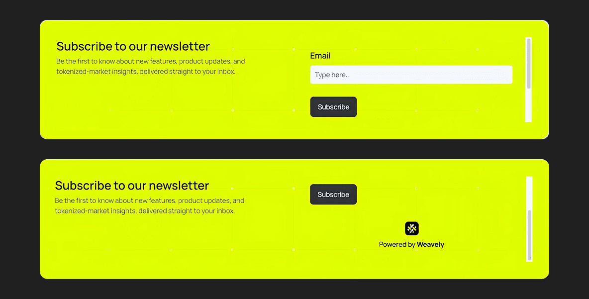
Screenshots showing the scrollbar bug on the banner
So we pivoted. I built the contact form as a new dedicated page in Figma, and our lead designer exported the code using Figma's AI tools, handed it to our CTO to merge with Firebase. We also added reCAPTCHA for spam protection. It was the one piece that needed engineering support – but it was a quick turnaround, not a full dev sprint. That's the "minimal" in "minimal dev support."
So we pivoted. I built the contact form as a new dedicated page in Figma, and our lead designer exported the code using Figma's AI tools, handed it to our CTO to merge with Firebase. We also added reCAPTCHA for spam protection. It was the one piece that needed engineering support – but it was a quick turnaround, not a full dev sprint. That's the "minimal" in "minimal dev support."

Animations need patience
Animations need patience
The built-in Figma Sites animations had a similar learning curve.
On the bright side, it lets you apply interactions and animations directly to components, which is a real time-saver when you're working with a design system.
The built-in Figma Sites animations had a similar learning curve.
On the bright side, it lets you apply interactions and animations directly to components, which is a real time-saver when you're working with a design system.

You'll prompt it, get something close, tweak it, re-prompt, and repeat until the timing and easing actually feel polished. It's not a one-shot workflow. And with Figma's AI credit limits now enforced monthly, those iterations burn through credits fast – I spent more than I'd like just wrestling with a simple ticker. Budget time and credits for iteration.
And here's the strange part – some animations that worked perfectly on solotex.com broke on the tx.org live site, even though we were using the same components and interaction flow.
Card interaction bug on tx.org
Same setup, different behavior. We never fully figured out why, and ended up sacrificing some of our best interactions and transitions just to get the site stable.
Same setup, different behavior. We never fully figured out why, and ended up sacrificing some of our best interactions and transitions just to get the site stable.
When vectors break on publish
When vectors break on publish
We also hit rendering issues with heavy, multi-layered graphics. Complex illustrations and layered vectors that looked fine in the Figma editor would break or glitch once published. We exported them as jpeg or png files, and paste the flat images back into the design frame. It solved the rendering problem, but created a new one.
Flat images don't play nicely with responsive layouts. At certain breakpoints, the images would crop awkwardly when resizing, and you lose the ability to fine-tune individual elements within the graphic.

The workaround was tedious but effective, I manually resized each image per breakpoint and uploaded separate versions for desktop, tablet, and mobile to make sure nothing got clipped.
The workaround was tedious but effective, I manually resized each image per breakpoint and uploaded separate versions for desktop, tablet, and mobile to make sure nothing got clipped.

It added time, but the result looked significantly better than letting the responsive engine guess. Still, it's a trade-off: visual control versus speed. We spent more time than I'd like to admit wrestling with that balance.
For now, my takeaway is this: Figma Sites is incredible for the design-to-publish pipeline. But the moment you try to inject custom code like forms, third-party widgets, anything interactive beyond what's built in, expect friction. The seams between "design layer" and "code layer" are still rough.
What worked better than expected
What worked better than expected
Not everything was a battle. A few things genuinely impressed me.
Responsive previews that don't lie. Figma Sites shows you desktop, tablet, and mobile side by side. What you see is what you get. No "it looked fine in the mockup" arguments with developers – because there are no developers in the loop.
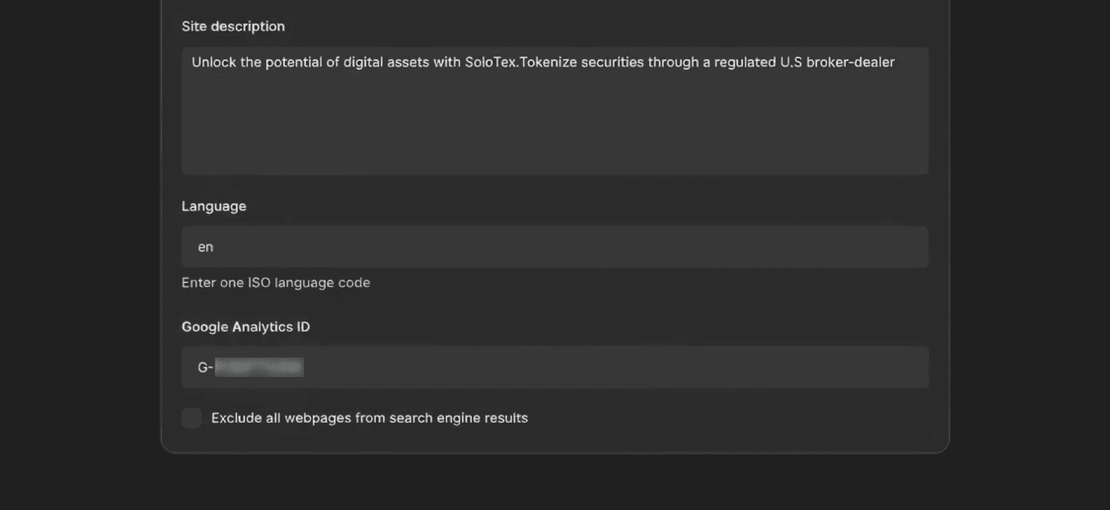
SEO and tracking out of the box. I was able to add Google Analytics ID and meta keywords directly through Figma Sites settings. For a marketing team that lives and dies by attribution data, this was huge, that alone saved us a few days of back-and-forth that would've happened in a traditional build.
Not everything was a battle. A few things genuinely impressed me.
Responsive previews that don't lie. Figma Sites shows you desktop, tablet, and mobile side by side. What you see is what you get. No "it looked fine in the mockup" arguments with developers – because there are no developers in the loop.
SEO and tracking out of the box. I was able to add Google Analytics ID and meta keywords directly through Figma Sites settings. For a marketing team that lives and dies by attribution data, this was huge, that alone saved us a few days of back-and-forth that would've happened in a traditional build.
Stakeholder reviews at the speed of design. Because the .figma.site link was always live, our CTO could review the actual site between meetings and standups. Comments came back the same day. I'd adjust and republish in fifteen minutes. We did more review cycles in one week than we'd normally do in a month.
Stakeholder reviews at the speed of design. Because the .figma.site link was always live, our CTO could review the actual site between meetings and standups. Comments came back the same day. I'd adjust and republish in fifteen minutes. We did more review cycles in one week than we'd normally do in a month.
The honest math
The honest math
Traditional workflow
Traditional workflow
Responsive design: 4 weeks
Responsive design: 4 weeks
Dev handoff and build: 4–5 weeks
Dev handoff and build: 4–5 weeks
QA and revisions: 2 weeks
QA and revisions: 2 weeks
Stakeholder reviews: 2 weeks
Stakeholder reviews: 2 weeks
Total: ~12 weeks
Total: ~12 weeks
Figma Sites workflow
Figma Sites workflow
Design and build (simultaneous): 2 weeks
Design and build (simultaneous): 2 weeks
Interactions, content, and iteration: 1 week
Interactions, content, and iteration: 1 week
Review, polish, and publish: 1 week
Review, polish, and publish: 1 week
Total: ~4 weeks
Total: ~4 weeks
Three times faster. Not because we cut scope – because we cut the gaps between steps.
Three times faster. Not because we cut scope – because we cut the gaps between steps.
What I'd do differently next time
What I'd do differently next time
Export the code for contact forms and go straight to the CTO. The hours I spent trying to make Weavely work inside Code Layers would've been better spent building the form page cleanly and handing it off from the start. Know where the tool's boundaries are before you hit them.
Export graphics per breakpoint from day one. I wasted time fixing cropped images retroactively. If you know your illustrations are complex, plan the rasterized exports upfront for desktop, tablet, and mobile – don't wait until things break on publish.
Be more conservative with animations. The flashy interactions looked great in preview, but caused stability issues across sites. Next time, I'd start with simple, reliable transitions and layer complexity in only after the core site is solid.
Who this is actually for
Who this is actually for
If you're a designer on a small team or startup like us, where engineering resources are precious and the website isn't the core product, Figma Sites is worth trying. It's not going to replace a full web application build. It's not ready for complex e-commerce or deep CMS workflows. The code integration story still needs work.
But for a marketing site, a product landing page, a company refresh? It lets a designer own the entire pipeline from first pixel to live URL. At a two-designer startup with no front-end to spare, that's not a nice-to-have. That's survival.
We shipped solotex.com in a month with minimal dev support. No staging server. No three-month timeline. Just Figma, a publish button, and designers who ship.